Figma File

Name: LinkedIn Creative
My Role: UX Designer - Research, Ideation, Design QA
Duration: 16 Days
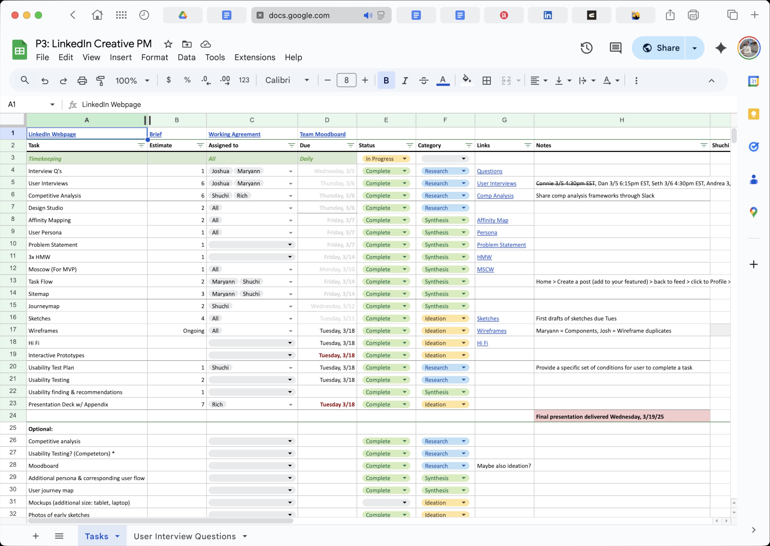
Deliverables: Research synthesis (persona, user journey, and all relevant assets), interactive prototype, 15-minute presentation, and presentation deck.
Team: Maryanne Hamilton, Richard Scott, Shuchi Mehta, Joshua Rosenthal
Tools: Figma, Otter AI, Zoom, Google Workspace, Slack
LinkedIn makes it easy to list your experience—but terrible at showing what your work actually looks like. In a 16-day sprint, we reimagined the platform through the lens of creative professionals, adding native portfolio features that let work speak for itself.
Our goal: to build a feature that adds value to both job seekers and recruiters.
The result: More meaningful engagement, better discovery for talent, and new monetization opportunities—all while maintaining LinkedIn’s professional identity.
We had been handed a simple project outline, and the clock was ticking. The discovery process started with a critical review of the brief. I wanted to distill it down to a summary. Then I jumped into looking at the market sector so I could better understand what the competition offered. The Dots and Contra both stood out as communities where you could find employment and show your work.


Current Landscape:
The Problem:
Design Opportunity
The morning of the fourth, we met as a team and outlined our workflow. Quickly arriving at a series of tools that would allow us to collaborate efficiently, maintain brand guidelines, and track billable time. We roughed out a timeline with aggressive delivery dates for key elements or waypoints.
We knew that we needed to look into how creatives currently use the platform, what they felt worked and where they were underserved. We also wanted to better understand what other products looked like. These two methods became the core of our research. From this data, we used a variety of methods to formulate a persona and a core set of pain points.
We decided it was best to split up the tasks, so I took the lead on developing the user interview questions alongside another teammate. I focused on crafting questions that would uncover behavior and motivations around three main categories:
We arrived with 8 main questions, an additional 7 clarifying questions. It was clear that there was a strong brand that we needed to work within, but we wanted to think outside of the box in the beginning. We conducted interviews from Tuesday the 4th through that Friday. The interviewees came from various places in their creative careers. We spoke to job seekers, the employed, and employers.
While these interviews were being conducted, we also ran a competitive analysis on The Dots, Contra, Instagram (preliminary interviews mentioned Instagram), Dribbble, and GitHub as well as web page builders like Wix and Squarespace.
What the research was starting to show is that people want to have full control of their content. Creatives will often use multiple systems to house and talk about their work/ services. They would display their visual work on Dribble and talk about it on LinkedIn while showing their code on GitHub and possibly even have their own web page or three.
There was another problem, LinkedIn’s image. Over 50% of our interviews showed disinterest in the platform, with people going as far as to state that it makes them feel commoditized and undervalued. It was becoming clear that a majority of creatives did not like using LinkedIn. We were starting to formulate some assumptions, but wanted to see the data synthesized before making the next steps.

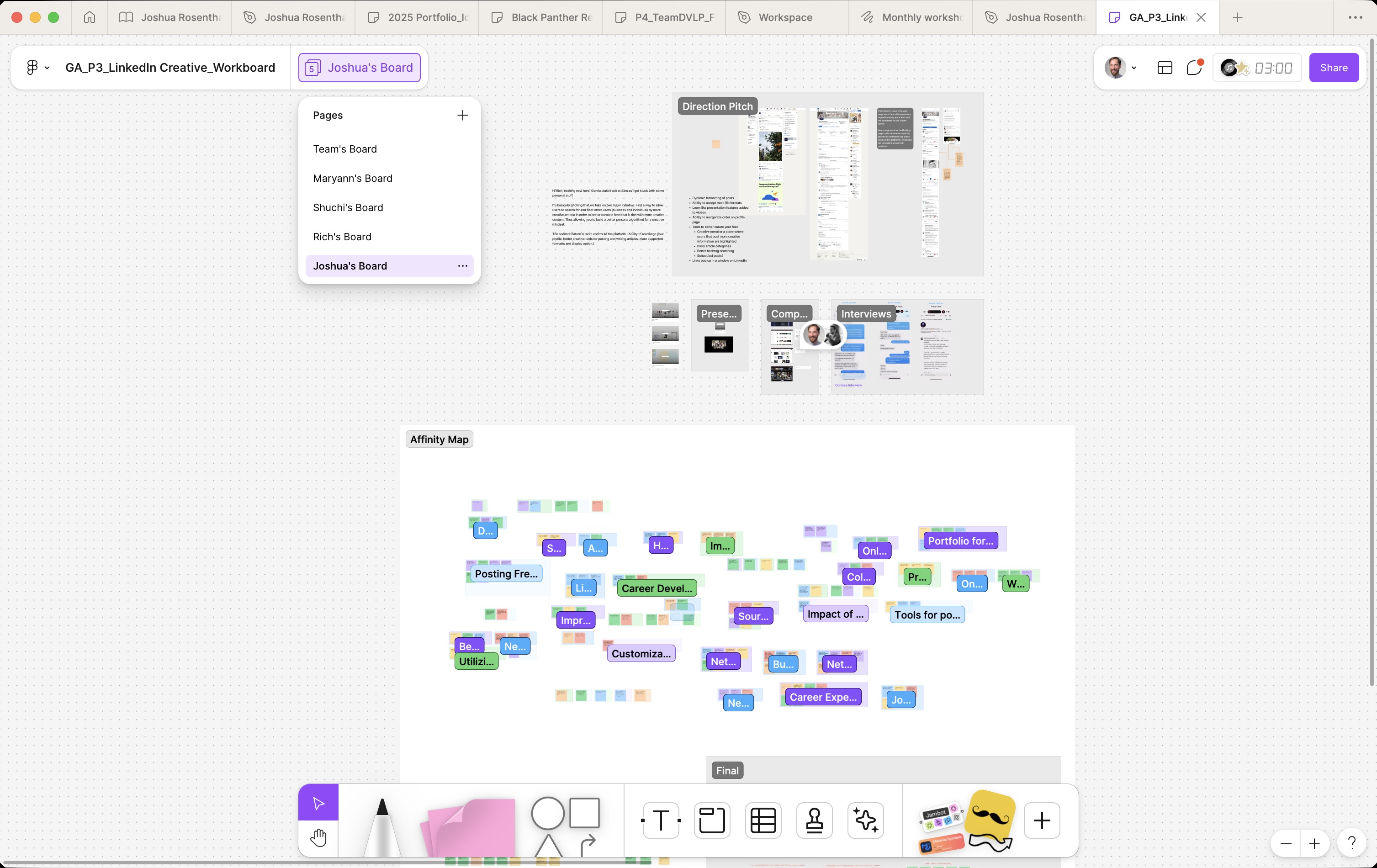
By the end of the week, there was good progress on the affinity map and a rough persona taking form. The competitive analysis was done and we had also come up with some “How Might We” statements based on our assumptions. It was late Friday, we had a Persona; meet Madelyn Torff.

Madelyn came with a problem statement:
"Madelyn Torff needs a more dynamic way to showcase her creativity in order to build meaningful connections and advance her career because professional networking platforms feel too formal and limit the ways she can express her personality and creative work."
Once we had a problem statement to work with, we started ideating. All four of us were sketching and coming up with feature adds or new products that could be explored. We talked about whether our changes would be on the web page or the app. When having internal conversations about the brand itself, we landed two main user groups:
We also began to believe that, in order to maximize the platform’s use, we needed to encourage more interaction. Our research revealed that a small majority of creatives on LinkedIn don’t engage with their community. This realization led us down a rabbit hole, which caused us some issues a few days later.
Monday came around, and we had shifted from our research synthesis into ideation. The four of us worked on sketching and our list of potential changes while also looking for design inspiration.
I was starting to develop some strong opinions around a need to better display media-rich content and rich text. I was also of the opinion that the profile page would need more customization. There were already tools in place to change how the information was held within each section of the profile, but there was no way to prioritize or reorder sections. This was one of the main changes I believed we needed.

As I explored LinkedIn more, I realized that both the “featured” and the “projects” sections did a horrible job of displaying the content on the profile page. There was no way to control how and where the image was cropped, and there was little control over what text was displayed.
While developing these ideas, a few others on the team started to ideate on a much more visual design. A portfolio page was starting to enter the conversation, along with a dramatic redesign of the feed. There was this growing opinion that we needed to make LinkedIn more visual to entice the creative professional into wanting to use the platform.
We were also starting to encounter another issue as well. This team was prone to very long meetings with no structure and no actionables recorded. We would often find ourselves in fruitless conversations for hours on end. It was starting to get in the way of our ability to complete important waypoints in the process
By Tuesday, we had wrapped our research and were refining ideas for restructuring the feed, improving creative tools, and introducing a lightweight portfolio feature. Morale was high ahead of a key stakeholder check-in that afternoon.

The session surfaced critical insights. While we aimed to make LinkedIn more appealing to creatives, our proposals were seen as overly visual and too similar to platforms like Instagram. This highlighted a disconnect with LinkedIn’s core values—professionalism, clarity, and broad utility. We shifted focus from reinventing the experience to enhancing features within the platform’s existing framework.
After the meeting, the team paused to regroup. I had long felt a portfolio feature might be a stretch and encouraged more emphasis on giving users control within LinkedIn’s current structure. I also raised concerns about features that might not serve non-creatives.
In the following days, some of us revisited research while others mapped task flows. Given the platform’s scale, we narrowed focus to only the areas our designs would affect—ensuring a more strategic, targeted approach.

Finishing the site map allowed us to gain more clarity on a task flow to explore in the prototype. We were quickly approaching the end of the week as well as our delivery date. We had started on the wireframes earlier in the week, but we still had a lot of work to do.

By Friday, we had completed a journey map and had a rough understanding of the systems we were developing. We had arrived on a few key changes and one big addition.

We got to work in figma but we only had a few days left… and we also had a few other big hurdles to overcome.
First, we didn’t really understand how this portfolio was going to work.
Second, we had not set up the Figma file’s variables or text styles properly so it was quickly straying from any standards the LinkedIn brand has established.
The week was done, we had some half-baked wireframes and 4 days. So we divided up the tasks and hunkered down for some long nights. One of the other teammates and I set to work on ideating the portfolio process. We took largely from sites like Wix and Squarespace as they have a tried and true method of developing simple but effective portfolios. I would spend the next 4 days tirelessly combing the Figma files to make sure that all brand guidelines, layout standards and heuristic choices were being adhered to. Another teammate started working on our presentation deck and the fourth spent her remaining days supporting the three of us.

The day before delivery we were 95% complete and we decided to run some usability tests. Since we didn't have much time, we were only able to get a couple out of the way but it was pretty clear to us that the features were well received. There were some stick points in the testing centering on verbage and button placement/ state changes. We would have liked to run some more tests before assuming what the fix should look like but there just wasn’t any time left…
It was Wednesday, March 19th and we had a finished prototype. We ran through the presentation with the last hour we had and sent it.
Working on LinkedIn Creative taught me the value of staying aligned with brand identity while pushing for innovation. It proved to me that it never benefits the team to stay quiet and forced me to work how I share my opinions. I gained deeper experience in synthesizing user research into actionable insights and learned the importance of maintaining design consistency through a design system, especially when collaborating in Figma.
The biggest take away from this project, do the groundwork. Had we taken the time to align on LinkedIn’s objective and build a Design System within Figma, we would have completely avoided the two biggest hurdles that we encountered. In that sense, I wish I made a stronger case in the first 2 days for the importance of clear communication and organization, in trying to soften up my generally extroverted collaborative style, I contributed to the missteps we made. Fortunately, my past experiences as a team leader allowed me to play a key role in recovering from those mistakes.
Next steps would be to run more usability tests and fine tune the portfolio’s integration in the platform. I would also like to explore how these new features might serve hiring managers/ recruiters and contribute to more effective candidate evaluation. LinkedIn Creative would add feature sets positioned for a vastly underserved user base within the platform. Frankly, I am very surprised that a solution like this doesn’t already exist. If implemented, I am positive that it’s value proposition would be felt by both creatives looking for work and those working within the LinkedIn Recruiting platform alike.